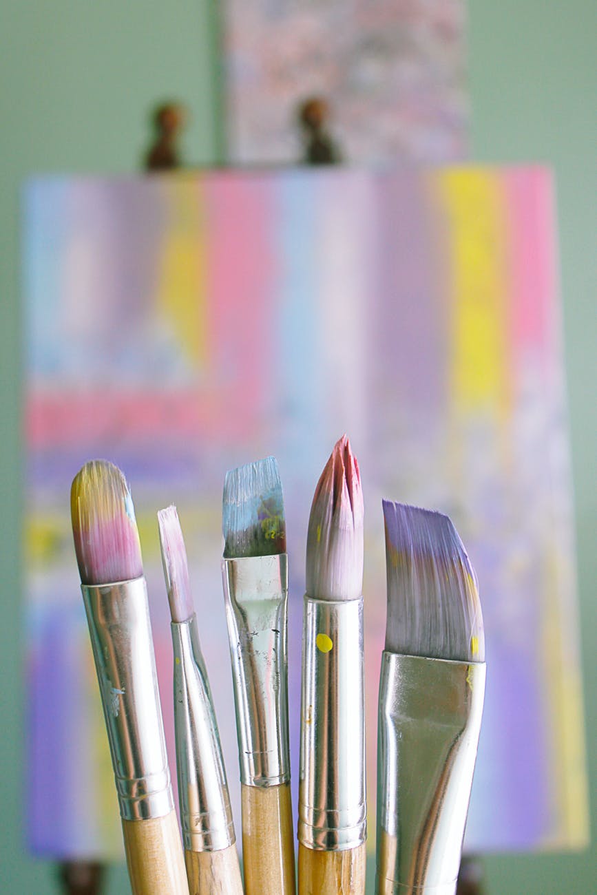

Every time you look at a Rothko, it evokes a deep feelings and their ability to articulate the language of the sublime.
He made colour his own language, but a language with the potential to speak to every viewer.
“These works touch us because they know exactly “where we live.” They speak to us, imparting a message akin to this is what it feels like to feel this way.”
Christopher Rothko
Slow Looking

The most beloved work of art in SFMOMA’s collection is, undoubtedly, Mark Rothko’s No. 14, 1960.
It’s an immense vertical canvas with horizontal rectangles, in this case a red-orange one above a dark blue one, that seem to float in front of an aubergine background.
But how did Rothko arrive at these works where people intuitively know what to do, and what makes them so special?
Biography
Marcus Rothkowitz was born in Dvinsk, Russia (now part of Latvia), in 1903. He immigrated to the United States in 1910, settling in Portland, Oregon, where his older brother had already moved and the rest of the family would relocate within a few years.
He enrolled at Yale University on a scholarship in 1921 and pursued a general liberal arts curriculum, but he dropped out in 1923 and moved to New York City, where he began his first formal art training—life drawing classes—at the Arts Students League. He began using shorter forms of his name as early as 1940, and he changed it legally in 1959.
The Colour Field Paintings

By 1950, the amorphous floating shapes of Rothko’s multi-forms had coalesced into rectangles, and the artist had arrived at the readily recognizable style for which he is best known—a deceptively straightforward combination of color and form that he would pursue for the next two decades, until his death by suicide, in 1970.
In these now iconic canvases, two or three, or sometimes four, rectangles appear one above the next on a vertical support. Painted with virtually immaterial brushstrokes that feather out at the edges, the loose geometric shapes hover almost atmospherically in front of their backgrounds, at once emphasising the flatness of the picture plane.
He pulls us into the painting as a world of its own, inviting or nearly demanding direct and intense interaction between viewer and picture. He creates a work that is its own domain, a place that encompasses a potent reduction of our human experience.

As soon as Rothko began exhibiting these new works, his colleagues and critics took note of color as a key component of their expressive capacity. The combinations Rothko favored varied considerably, but they were rarely as expected as, for instance, complements on the color wheel. He was especially drawn to fiery oranges and reds.

In fact Henri Matisse’s The Red Studio (1911), in MoMA’s collection, was a longtime favorite painting.

In 1957, Rothko’s palette got darker, and his very last works, from 1969 and 1970, were dominated by black and gray.
“I am not interested in relationships of color or form or anything else,” he elaborated. “I am interested only in expressing basic human emotions—tragedy, ecstasy, doom, and so on. . . .”
Mark Rothko
Conclusion
For Rothko, a canvas that was purely decorative was meaningless. The success of a painting was not just about aesthetics, but about how and what that painting communicated. And he sought to translate the journey of making the paintings to his viewers.
The Rothko’s paintings are a moment in history, as indeterminate and inviting as ever, conducive to slow looking, and somehow creating space for both pleasure and profound experience.
 Rothko: The Color Field Paintings (Book for Art Lovers, Books of Paintings, Museum Books)
 Rothko (Basic Art Series 2.0)
Disclaimer: All recommendations are impartial and based on user experience, with no bias to the products or the brand. The products in this post may contain affiliate links.
[…] The Universal Language of Colour: Mark Rothko […]